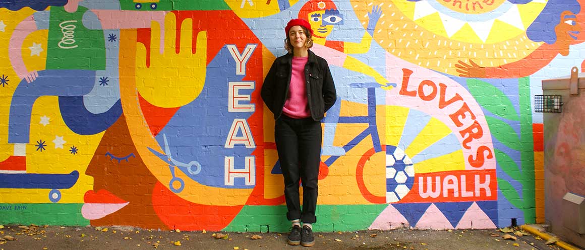
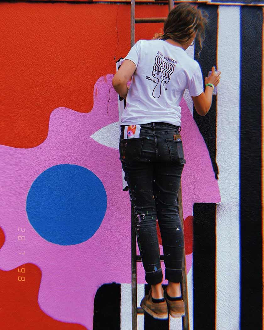
When we decided to redesign our packaging, we knew we wanted to commission a local artist with similar values to us. That’s when we found Zoë Power. Zoë is a Bristol-based artist known for painting murals and signs, as well as for her illustrations and lettering.
We recently caught up with Zoë to talk about her work, influences, and her favourite playlists to work to. Here’s what she had to say:
Tell us a little about your career so far.
In my 20s I was very political and keen to change the world in a very direct way. After studying Anthropology, I wanted to work in marine conservation. I worked and volunteered for organisations for years, however I’ve always been very creative and was always making art alongside this.
I didn’t really consider that I could make a career from my art until I started to paint signs, which started in the restaurants I worked for and quickly led to a bedroom full of a-boards and chalk boards. Sign writing led me to doing a few murals in restaurants, which really gave me the bug for large scale painting! This was the gateway to the path that I’m now following and, after having recently studied an MA in printmaking, my mural work also feeds in illustration and printmaking.
What do you love most about living and working in Bristol?
I grew up in Bristol and came back here around 5 years ago. I’ve always loved it, and as a young person I really relished in the arts and music scene here. The creative community is always pushing boundaries. The best gigs and theatre shows always come to Bristol – it’s not a city where you have any excuse to be bored. On top of that it’s a city which feels environmentally conscious and forward thinking.
What do the people on the Natracare packaging represent to you?
We wanted the figures to feel powerful and strong. They are curvy but I’ve still tried to make them diverse and trans-inclusive. The figures are active, in and around nature, not burdened by fashion or products. They represent a harmonious relationship with our environment.
And the plants?
The plants are wild, powerful, and dreamy. They are loosely based on real plants, but I really wanted to give a sense of imagination and awe. There are some references to coral, nodding to the plastic-free nature of the products, which we all know wreaks havoc on marine environments.
What’s your favourite of the packs?
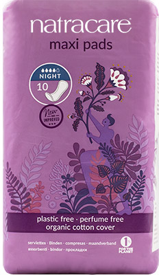
That’s difficult – probably the Maxi Pads. Inspiration for the figure came from photographs of protesters holding flags and banners at protests. This figure feels particularly dynamic and strong to me and I like how the plants seem to be rising up, flourishing from the grassroots.
Try our plastic free maxi pads
For period products that are biodegradable and compostable, from a campaigning brand, we’ve got you covered!
Find out more
What’s your favourite piece by you, ever?
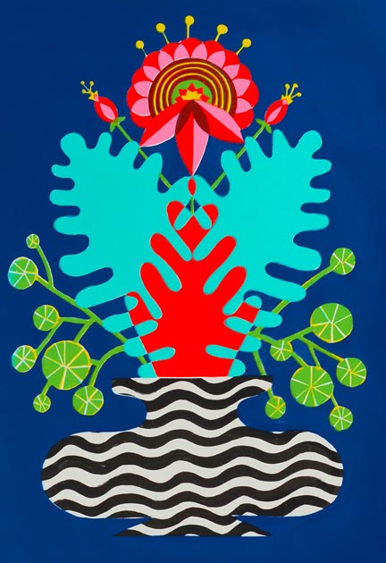
Ha, I’m probably not the best person to ask as I can be so critical of my own work. However, if I had to choose it would be my ‘Flourish’ screen print. I really enjoyed working with the colour overlays made by a screen print and love the striking colours on this piece.
Do you have any favourite artists or concepts that particularly inspire you or your work?
I love looking at old lithograph printed packaging, screen printed posters, 70’s wallpapers and fabric designers. The old printing techniques really required the designers to be very clever and meticulous with their colour choices. I really enjoy translating some of the colour overlays of screen printing into my illustration and mural work.
I’m inspired by cubism, letter forms, and the environment and common themes in my artwork touch connection, community, and feminism.
What’s on your playlist for when you’re working on a project?
I have a bit of a routine that changes what I listen to. I do emails and admin in the morning – Charlie Bones’ morning show on NTS keeps the juices flowing to this. Then if I’ve any concepts or designing to do, I really have to focus so definitely can’t listen to anything with words or chat – ambient electronic stuff is good for that.
In the afternoon I like to listen to music or podcasts. I’m currently working through ‘Who Cares Wins’ by Lily Cole, where she speaks with guests about solutions to combatting climate change. Music wise, I’m generally a sucker for older stuff including J.J Cale and John Martyn, but my album of 2020 was definitely ‘Untitled (Black is)’ by Sault, check it out if you haven’t already.
If you had to describe your artistic style in three words, what would they be?
Bold. Colourful. Curvy.
How does feminism play a part in your art, and was it important on this project specifically?
Working in murals and street art, I’m very aware that I have a huge platform. I want to re-claim our visual environment and so I often try to re-write the script – showing womxn in active poses, being powerful and not just selling shampoo on a billboard. I try to subvert the male gaze and want womxn to feel inspired and empowered. Visual art is a universal language and I want to make the most of that.
What about inclusivity? Your works include a real variety in bodies – is this intentional?
Yes definitely. We’ve been conditioned to think that there is a ‘normal’ or ‘right’ body. In my opinion this is not only a tool to control us and sell us products, but it’s really dangerous for young people to grow up being judged so harshly on their appearance. Wouldn’t we all like to live in a world where we’re judged on our actions, not our waistlines?
What’s next?
I’m really excited to be painting a huge mural for Coventry City of culture. It’s almost 100 metres long, so will be my biggest project to date.
Do you have any advice for creatives getting started?
Have faith, keep going, and don’t be too hard on yourself.
You can check out Zoë’s work here, or on her Instagram. Tell us what you think of the new packaging designs in the comments below!
